Chase Authentication Experience
Company
Chase (2021–2023)
My role
UX Design Lead
Team members
Product Owner, Content Editor
Timeline
4 months for MVP, 2 weeks for research spike
Background
The main product I supported at Chase was the step-up authentication experience for customers. In about 4 months, we designed an MVP of what we call “Challenge as a Service” or “CaaS” which is a somewhat configurable set of challenge methods built to be product-agnostic for over 35 Chase journeys. This service is meant to protect Chase customers from fraud through a consistent and more secure step-up experience.
Goals
Create one consistent authentication experience for all Chase customers
Adopt updated design system components and patterns
Challenges
Getting alignment with other teams needing to integrate our experience into theirs
No dedicated research support
New patterns & components
Some variations of CaaS existed before, but they weren’t using the latest design system components, weren’t using consistent typography, spacing, or grid utilization throughout, and needed some content strategy love. I partnered with an editor on my team to recreate the entire flow and build it in a way that’s configurable enough to work with the new architecture design and risk rules. We also addressed new error scenarios, considering more branches of the user journey than were considered previously.
Before
After
Design & delivery
Some variations of CaaS existed before, but they weren’t using the latest design system components, weren’t using consistent typography, spacing, or grid utilization throughout, and needed some content strategy love. I partnered with an editor on my team to recreate the entire flow and build it in a way that’s configurable enough to work with the new architecture design and risk rules. We also addressed new error scenarios, considering more branches of the user journey than were considered previously.
Investigating qualitative data
As we monitored data from the rollout of Challenge as a Service, stakeholders expressed concern over higher drop-off rates than expected in the wire transfer flow. That led to an ask for a new piece of content on the first screen to tell users that their action would be canceled if they did not verify their identity.
While facing a lot of pressure to make this particular content change, a growing list of hypotheses from all sides on why users might be abandoning the flow, and no capacity for our research team to support this work, I spearheaded a research effort that turned the tables and allowed us to deliver a more meaningful change.
User research
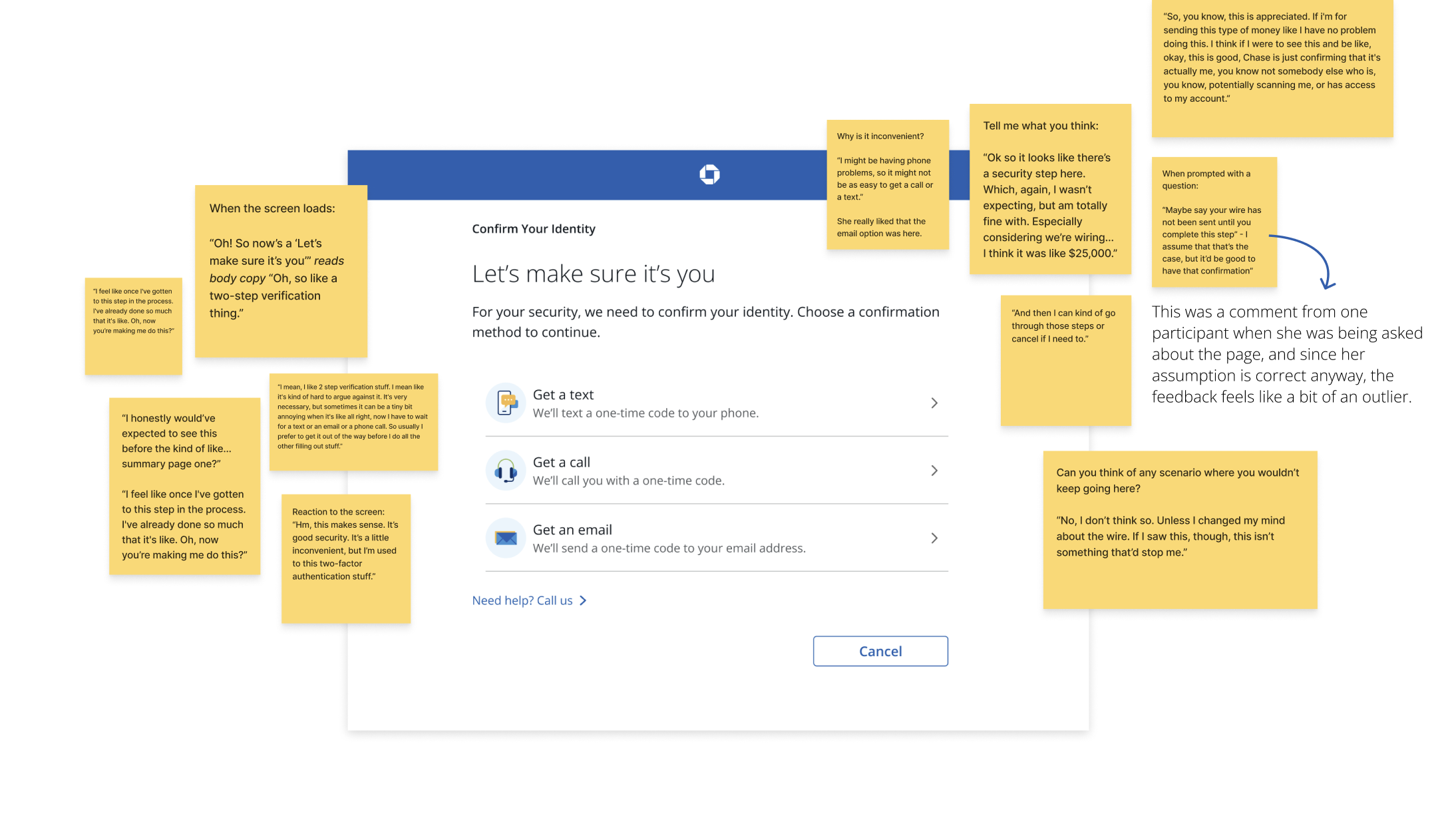
Since our research team didn’t have any capacity to conduct testing, I connected with the design teams who supported the payments products that Challenge as a Service was fitting into. In a rare cross-team collaboration, one of their researchers volunteered her time to facilitate the sessions through UserTesting while I gathered all the materials she needed to recruit, created the prototypes, and settled on a testing scenario with some input from the payments product owner.
I invited all our stakeholders to observe the sessions, and they shared some really great feedback as some of them had never had a front row seat to that type of research before. I also took thorough notes for each session, following a note-taking system I set up in FigJam.
Synthesizing results
Since our research team didn’t have any capacity to conduct testing, I connected with the design teams who supported the payments products that Challenge as a Service was fitting into. In a rare cross-team collaboration, one of their researchers volunteered her time to facilitate the sessions through UserTesting while I gathered all the materials she needed to recruit, created the prototypes, and settled on a testing scenario with some input from the payments product owner.
I invited all our stakeholders to observe the sessions, and they shared some really great feedback as some of them had never had a front row seat to that type of research before. I also took thorough notes for each session, following a note-taking system I set up in FigJam.
User quotes
“I think I was expecting a code. We’ve been trained that you’re getting a code on the phone.”
“I would assume that it’d text me or send me like a code if I were to click next right now.”
“I expected to need to open the messaging app (iMessage) and see the notification there.”
Opportunities
Clarity on how push notifications work
Highlighting use of Chase app vs. leading users primarily just to the notification
Clear direction on how to complete the in-app process
Suggesting next steps
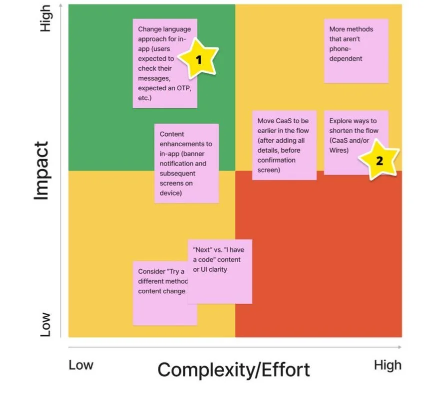
The researcher facilitating the sessions created a rapid report on the testing outcomes, and I took that (along with my notes) to map out some enhancements that could be worthy of our time to pursue. I plotted the enhancements on an impact vs. effort matrix to get a sense of what could be added to our roadmap to potentially lower drop-off rates, and I shared it with our stakeholders.
#1 prioritized enhancement
Improve education and guidance with in-app verification method
#2 prioritized enhancement
Explore ways to shorten the flow (CaaS and/or Wires)
Outcome
As a result of some slight content changes across 6 pages of Challenge as a Service, the drop-offs tied to the in-app method dropped from 20% to 16% within the first month.
More work
Traverse UI Redesign
KeyBank Account Originations
Passion Projects
Caseworker Mobile App
Logo Design
Seasonal Campaigns


